Formal Critique #1
|
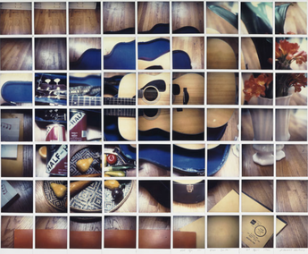
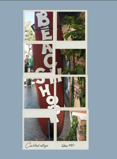
Describe: This image showcases a guitar laying in it's blue case. Surrounding it are flowers, and various other random items on the floor. The image shows what looks like a lived in, often used scene. Reflect: The image collage is composed of multiple polaroids and feels very relaxed. It very much feels like this image depicts something simple but admired by Hockney which is why he took the time to capture it in an artistic way. This image also has clear distinct areas of primary color. Formal Elements: This image's point of view is taken from above. It avoids simplicity because although the background is uncomplicated, the focal length is very short and all the items have equal visual value. The guitar case and papers on the floor help to create lines in the images composition. Describe: This photo mainly shows a surfboard signs advertising a shop. The photo also has a fair amount of plants. In addition, there are people walking by in the background. Reflect: This images are meant to look as though they are also polaroid photos. I tried to also emulate the presence of primary colors. This subject was chosen because it is simple but also well known to me. Formal Elements: In this image I used the plants to frame the board. Though the images themselves don't create the lines, the artistic choice to take them as polaroids creates horizontal and vertical lines. Another element I used is expansive depth of field to try and avoid simplicity as well. |
Formal Critique #2
|
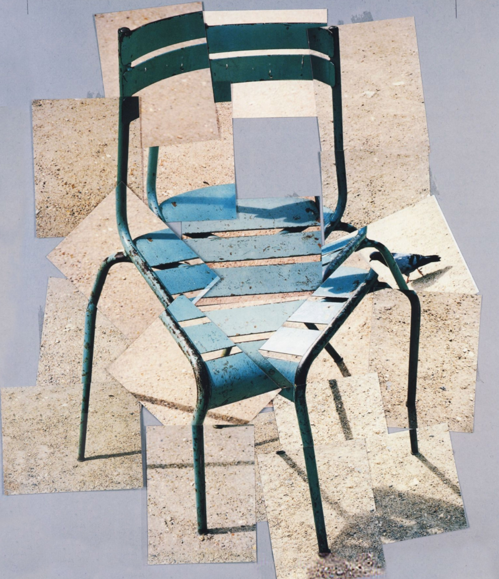
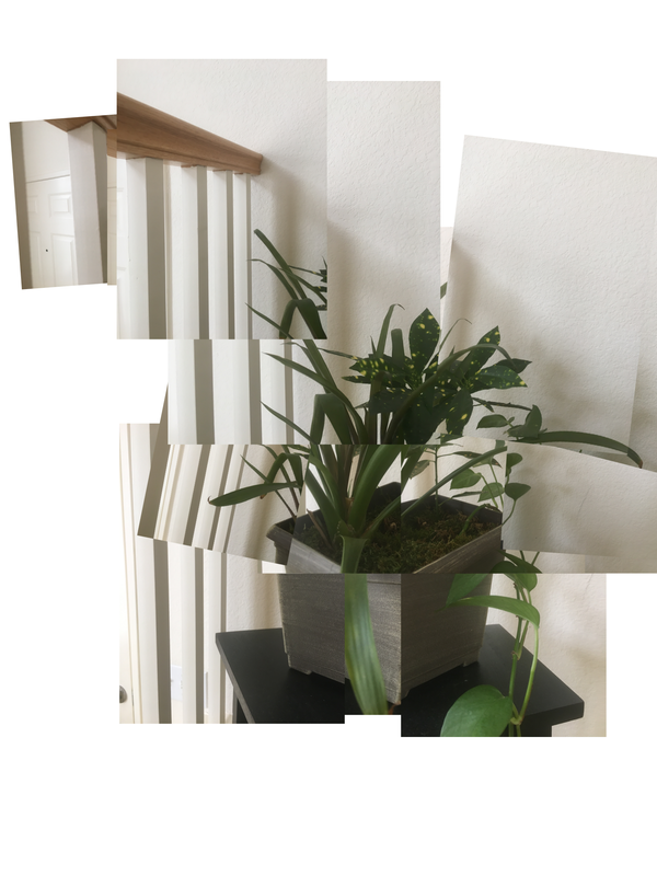
Describe: This image shows and old, rusted metal chair. It is sitting on the dirt ground. In the background, there is a bird passing. Reflect: The collage of this chair has multiple perspectives that don't perfectly match up with each other. This photo is pretty true to its original, it might not be edited at all. It is interesting that Hockney likely shifted the perspective on purpose. Formal Elements: This image is taken from above, it's the view of someone approaching the chair as if to sit. The collage was created in a way that breaks the rule of thirds so that the chair is centered. The point of view creates simplicity in this photo because the only background is the ground. Describe: This image shows a plant in a grey pot. The plant is resting on a black stand which barely shows in the photo. It is up against a stair rail and a wall. Reflect: I tried to emulate the slightly off parts of the collage, but instead of changing the angle from which I took the photos, I took some slightly closer. I also kept this photo close to unedited, only adjusting the highlights and shadows. My favorite thing about this is the single vivid color amongst all the neutrals. Formal Elements: I also took this image from slightly above but also moved closer to the level of the subject. The majority of the collage keeps the subject centered but I added a single picture in the top left to show how I might have composed this image normally. I also created simplicity in this image by taking it against an almost all white background. |
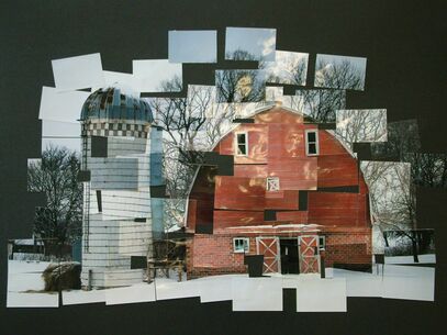
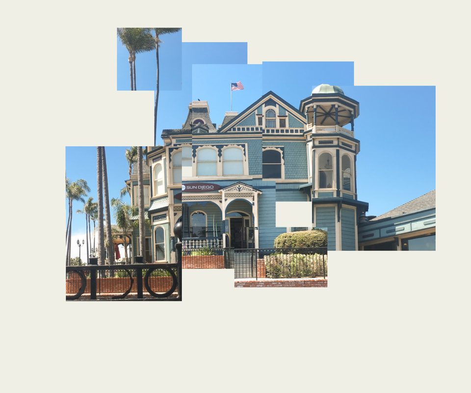
Formal Critique #3
|
Describe: This image shows an old, worn down red barn. Next to it is a tall silo with a hay bail next to it. There is a blanket of snow covering the ground with towering trees in the background. Reflect: I like that the red and the blue tones compliment each other so well in this photo. The collage isn't formed to make a perfect square and some parts of it are 'missing'. I wonder if this was something Hockney just came across or if this place is personal to him. Formal Elements: This series of photos is taken with expansive depth of field so that you can clearly see the trees in the background. The structures themselves create curved lines in the photo. This photo also utilizes value balance where the red barn is balanced out by the cool tone in the rest of the image. Describe: This image shows a blue structure on a sunny day. The tower on the right of the building is similar to the shape of the silo in Hockney's photo. The background is a clear blue sky. Reflect: This photo has a large amount of blue in it with some brick and trees to contrast. In a similar way to Hockney I tried to make sure the collage wasn't a perfect square and I left a couple sections out. I chose this building because it is familiar and representative of summer time for me. Formal Elements: These images are all taken with expansive depth of field so that the railing in front along with the trees in the back are in focus. The structure creates some diagonal, vertical, horizontal, and curved lines. This photo lacks value balance which is something i might have fixed by including more of the brick wall. |
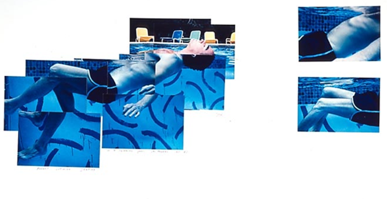
Formal Critique #4

|
Describe: This image shows a guy floating in a pool on his back looking up. In the background there's a variety of colored chairs. To the right there are a couple isolated images of the guy swimming.
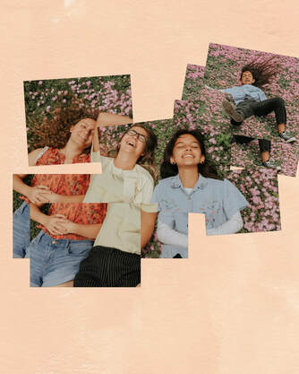
Reflect: This image has super vivid colors, especially the blue. It is cool that Hockney expanded his photography to underwater for this. The photo captures a still of an action that surely took a lot of movement. Formal Elements: These images are taken with expansive depth of field so that the chairs in the back are in focus. The point of view is eye level with the guy floating in the water. The collage as a whole creates rule of thirds even though the actual section with the subject has the subject centered. Describe: This image shows three girls laying down. They are laying down on a field of pink flowers. The upper right of the collage shows an image not connected with the rest of a gal falling in a glorious way. Reflect: I tried to emulate the vivid colors in this image but I focused on the warm tones instead of the cool ones. Similar to Hockney's image, mine has areas that don't match perfectly because there was movement happening between photos. Formal Elements: This image is taken from above so that the subjects were parallel to the camera lens. This image is somewhat using rule of thirds where the center subject is on one of the three lines and the additional image of the gal falling pushes the subjects to the right. This image also has a fair amount of value balance because each of their shirts is a different primary color. |
Formal Critique #5
|
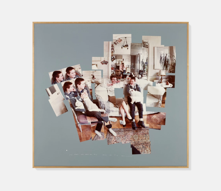
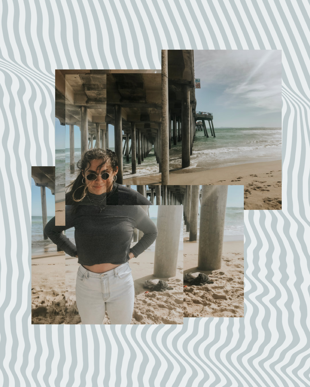
Describe: This image shows 'four' people, 'three' of which are kids, sitting on their couch. Multiple of them are holding cats. In the background you can see Hockney taking the photo in the mirror. Reflect: The blue background that the collage is one contrasts the warm tones in the image. It's interesting that the boys on the left have duplicates in the collage. I like the relaxed setting of the photo. Formal Elements: This image is taken with expansive depth of field which allows you to see their house and Hockney through the mirror. The setting creates a lack of simplicity and the duplicated people also add to the amount of things to look at in the photo. The photo is taken from just above the point of view of the subjects. Describe: This image shows a girl at the beach. She is underneath a pier that extends past her in the background out towards the ocean. The image has warmer tones in it. Reflect: The background of the collage is also meant to balance out the warm tones but it's also meant to complicate the photo a bit. In the same way the boys were duplicated in Hockney's photo, there are parts of the pier that are duplicated in a less obvious way. Formal Elements: This photo is taken with expansive depth of field to show the ocean and pier in the background. This photo is also taken from slightly above eye level of the subject. The subject's placement creates rule of thirds in this collage. |
